Showing posts with label Print. Show all posts

Saturday 9 April 2022

Monday 15 February 2021

Sequential Illustration; A brand new module! The following posts are projects which illustrate something sequential about an animal

Ruby Gregory

This sequence depicts a squirrel trying to get to the food inside a squirrel proof bird feeder which is weight sensitive. meaning that when a squirrel attempts to jump onto it, it will spin stopping it from getting into the birds feeder.

The sequence shows that a squirrel won’t give up and will do and try anything they can to get their food, which I illustrated with a GIF I created on a loop to show a squirrels life on the struggles they would go through to get food.

I'd made leaf prints to use as a stencil on the squirrels to show its nature and where they live. I thought the effect of having the squirrels as leaves looked like another sequence of leaves blowing through the wind.

Tuesday 2 July 2019

Very Superstitious

Charley Perrio

A collection of British superstitions, fuelled by my own superstitious rituals and beliefs, passed down through generations. Each aspect within the collection explores and celebrates the oddities and quirks within British culture. 


I began to gather old English Superstitions and anecdotes from my leading textual resource: Iona Opie and Moira Tatem’s A Dictionary of Superstitions (1989). Research into object and nostalgia alongside Jessica Roux’s Lucky You zine inspired the form of a collection, showcasing both Britain’s commonplace and lesser-known superstitions. Further exploration into Feng Shui, amulets and symbols led me to create a collection based on an individual’s superstitious possessions within the context of the home. The final outcomes within the collection combine my love for printmaking, textile design and embroidery, inspired by my leading influences: Alice Pattullo, Katie Scott and Ellie Mac Embroidery.


The collection celebrates both good and bad luck in equal measure through prints, textiles and objects associated with the home and personal belongings. I consciously chose to create a collection as I felt this was appropriate in documenting my leading subject matter - British superstitions - with themes of amulets, luck and fate leading back to the object, nostalgia and possessions. Within the final outcomes the combination of text and image is needed to illustrate more obscure superstitions, educating and informing the audience in a light-hearted, satirical manner. The personal aspect and narratives within this project have been significant with developing the final outcomes and has strengthened my viewpoint on the subject matter, making the collection organic and unique.


Wednesday 27 February 2019

Lino-mation


'Lino-mation'

Individual Lino cut stills printed by our students and and compiled as a group animation by Dominic Leatham (Leatham.co.uk)


Thursday 9 March 2017

Rat - Jakub Marjanski

I decided to follow the Rat for the project, the reason I took the rat is because the idea of an animal that represents pestilence fascinated me. I instantly jumped to looking at the disgusting side of rats and found that the animal is actually quite clean. I had to look quite hard to find pictures of sewer rats and diseased ones on the streets of New York city. Eventually I collected a range of images that I sketched out.

With that I went on to look up the pestilence part of this project. I looked at depictions of gods and concepts such as the 4 riders of the apocalypse. In my search I found the black death and that it came in 3 different versions that plagued different parts of the world. I decided to make that my main theme.


With that discovery I decided that I should depict the disease moving from one place to the other like it did. In a tutorial I was informed of concertina books, their long length were perfect for the subject.
Final Piece


The final piece was made with 3 cellulose thinner prints of works I have done in my book, each representing the location where black death happened. The in-between parts are transitions made with a Graphite pencil (I also went over the prints with it to make them darker and feel like an old painting). The band around the book was made with a map to add to the travel aspect and the actual book is made with Fabriano paper. It's missing text that was meant to accompany the images but I didn't have enough time to add them to the piece.
The first image represents the Byzantine empire, second Europe and last China.

Sunday 5 March 2017

Frogs

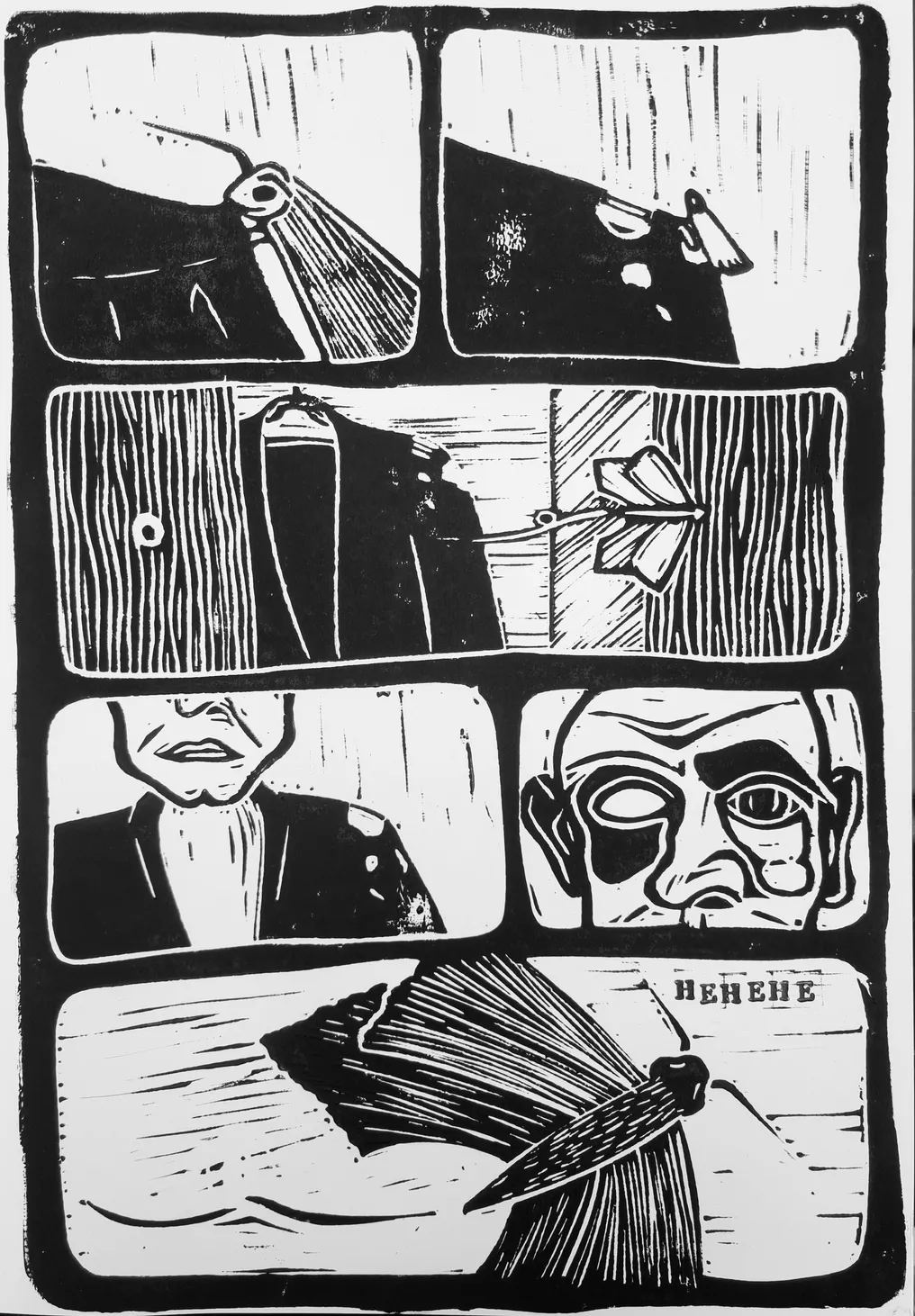
For my Research Methodology project, I chose to study frogs. I found them intriguing in the sense that they were considered either cute pets or horrible creatures - there is no in-between. Aside from their reputation, they are very interesting animals and have so many variations. This post shows a sample of my project and my exploration of frogs.

In my research I investigated the things most commonly associated with frogs. I looked at their patterns, their movements and their noises in an attempt to understand them better to find a way to represent them. First, I looked at the distinctive markings of the common frog, the kind you're likely to find in your garden. I experimented with different mediums to find the best way to represent the texture and patterning of a frogs skin. I found watercolour to work particularly well as it had a softer effect that suited the subject.


I also experimented with etching to create the patterns of frog skin. I tried the standard form of etching and found that the pattern edges were too harsh and bold. In the example shown, I used diluted watercolour paint over the dried ink to add a green tint to the etch, adding a little colour. Despite this, the darker patches of the pattern still look harsh. My second etching attempt was much more successful and had a more natural-looking finish. For this plate, I removed the ground for the patterning with a pencil eraser which removed it unevenly and gave the faded outline to the marks. I then treated and inked up the plate as normal and found that the ink collected in the uneven patterns, then forming darker areas on the print which looked great. The print shown is my favourite of those taken from the second plate as it showcases the pattern brilliantly but still maintains as an overall image of a frog.


This next image is of my piece from the mechanical animals workshop. In this session, we were encouraged to create a representation of our chosen animal created out of mechanical elements. In my piece I really wanted to convey the frogs hopping movement in the springs under its feet and the powerful legs crammed with gears and other machinery. The springs might look comical, but they communicate my message well.

In the last image, you can see my piece from the workshop led by guest lecturer My Dog Sighs, inspired by his Free Art Friday initiative. The workshop encouraged students to find a piece of litter and to rework it as a piece of art. Students used cans, bottle caps and scraps of paper for their work. I found a seed from a sycamore tree and thought it looked a lot like a tadpole. I then used acrylic paints to paint the seed as a tadpole, with the markings and a little eye. I think this piece is very effective, and is a good representation of a tadpole.

Wednesday 1 March 2017

Ladybirds

Acrylic ladybird illustrations
For the Research Methodology unit I decided to look into ladybirds as they are my favourite insect and commonly associated with Britain's gardens. With the painting above I wanted to illustrate the delicacy shown through the insects size and features; I chose to do this through the medium of acrylic paint in order to utilise the vivid colours shown on the ladybird's body.
Warhol inspired lino print edit

After researching into the works of Andy Warhol for his use of bright colour and repetition, I decided to experiment with lino printing as it's a medium I had not used before. I used a black ink to print and then scanned the image into photoshop in order to change the colours making the ladybirds bright and bold, juxtaposing the stereotypical colours associated with ladybirds.
                                                                       
As part of my research process I began to look into the decorative pattern of the polka dot - which is my favourite pattern and is a key association to the ladybird. Here I made hanging circular pendants using acetate after being inspired by the artist Olafur Eliasson and his installations highlighting light and circles. I took this notion and combined it with the idea if the ladybird to create this composition with the ladybird painting being shown to hang in suspense within the piece.

               
'Ladybird Interior Collection'
The research into the decorative pattern of the polka dot lead me towards my final outcome 'The Ladybird Collection' where I made a set of four interior accessories: a cushion, lamp, door knobs and wallpaper. Research into a ladybirds habitat portrayed the negative connotations in the media of ladybirds within the home; I wanted to take this idea and turn it into a positive. I made the collection by fabric printing, up cycling and utilising old materials within the home which all had red polka dots and ladybirds making the collection stand out as a whole.

Bears - Florence Mackintosh

For the Research Methodology project I chose to look at bears. To begin the project I did some research into all eight species of bears, before focusing more specifically on the two species I was particularly interested in - the grizzly bear and the moon bear. I was interested in the bear's habitat and did some research on Yellowstone National Park, which involved reading articles and watching documentaries to familiarise myself with the visuals of the landscape and the way in which bears move and behave, as well as visiting the Natural History Museum in London to gather some first-hand research. 


My findings from my research into Yellowstone led me to explore further the relationship between bears and humans. I looked at the long history of bear cruelty, learning about dancing bears within the Romani culture and how, in some parts of the world, the practice of training bears for circuses and the capturing of bears for bile farms is ongoing. I thought about how I could portray the stories of these captured bears and an initial idea I had was to write and illustrate a book for children.


During the process of developing my idea I thought about how some children's books illustrators expand their product further by creating merchandise along side their book. My idea was to create a brand, inspired by the name 'Moon Bear', which had appealed to me visually, particularly for a brand targeted at children. I went on to develop ideas for products I could make for a nursery collection - cushions, babygrows, wallpapers and framed prints. I realised this idea through fabric printing for the cushions and babygrow, and using photoshop to develop designs for the print and wallpaper samples. 


Towards the end of the project my focus became much more visual than contextual. I was interested in the aesthetics of the products I was making - the lines and colours as well as the media and materials. Although the story book was not my final outcome, it was an important part of the process in developing the 'Moon Bear' collection. I would not have been able to do this as successfully without thoroughly researching the subject of bears.

Tuesday 28 February 2017

Llama - Emma West

Creating my own Peruvian style patterns

My chosen animal for Research Methodology was the llama! I chose it because of its characteristically quirky and humorous nature and appearance. I was also given the nickname 'llama' a few years ago by my friends (to this day I still don't know why!) - so I figured it would be fun to work with an animal that I had some association with. My initial thoughts on how to approach this project would be gaining more information about them and the environment that they live in, which led me on to researching about Peru and its culture. This also prompted some historical research in the 'Incas' - in which I learnt about the multicolour llama deity 'Urcuchillay' and the importance of textiles in their culture and traditions. From here I experimented with creating my own Peruvian style patterns, and incorporated a lot of vibrant colours into llama drawings - inspired by both Peruvian culture, Andy Warhol's pop art work and the Fauvist movement. 

Through my experiments and cultural research influence I decided to take a textile based route, thinking about how I could use sewing, knitting and other wool based crafts. The five words I chose allowed me to have some real fun with experimentation and idea development, from the beginning of the project I knew that I wanted to create something fun and colourful. The five words I chose were Quirky, Goofy, Proud, Rugged and Colourful, all of which relate to their appearance and characters, as well as cultural roots. 


Embroidery experiments


Using textiles was a really good choice, it allowed me to re-familiarise myself with machine sewing and I got to revisit experimenting with embroidery which I enjoy doing in my spare time. The final pieces turned out exactly how I wanted them to! Together they encompass the five words and summarise the colourful, quirky nature of llamas. The two embroideries feature colourful patterns inspired by Peruvian textiles, displayed within the llamas coats to reflect on their home country and the culture of it. The weave is a physical representation of the llamas rugged coats combined with Peruvian inspired colours, Tulunpi ear decorations and pom poms they are adorned with during festivals. The three googly eye prints are a response to Andy Warhol's 'Marilyn Monroe' print, duplicating and varying colour palettes to create individual characters whilst adding some extra fun and humour to the llamas. 

Final pieces on the wall together!


Tuesday 29 March 2016

Dog - Kalem Richardson

This is a poster I made to give awareness about violent dogs by using black to connote fear and the unknown using the Rorschache ink test method to create a dog image.

I was using black ink because the colour connotation of black is fear, the unknown and others but those 2 things would help me make a good poster with a sense of enigma to make the audience question my work.


This page is on the recreation of a dogs' eye using pencil sharpenings and glue.


On this page is the recreation of a dog paw using water colours for one and pencil for the other trying to get the shape and colours similar.


This page in my book is based on the fact that the word dog can be used to label humans just as much as dogs. I used my hands to make dog puppets as a metaphor for human dog.


In this image I used brighter colours like yellow because the connotations are happy and positive, and using more fluent lines while drawing making it seem like a gentle dog.


In this image I used sharp lines and blacks to connote danger and fear and by using no features apart from mouths/teeth which is highlighting the things that we mostly fear about dogs.


Wednesday 18 March 2015

Tegan Meredith - Research Methodology - The Hedgehog

For my Research Methodology project I wanted to research hedgehogs. I found them quite gentle creatures that feature often in children's stories as well as being one of the most recognisable woodland creatures in our British wildlife.

                                         
('The Fox and the Hedgehog' stop motion animation I created with Helena Sepehr)

Through thorough research I discovered that the hedgehog is declining quickly in population due to many environmental factors, including fatal attacks from predators.

                                                 
(Created using Charcoal and Adobe Photoshop)

Hedgehogs are vulnerable animals that are only armored by their spines. I wanted to look into how hedgehogs are protected as well as how they are seen in children's story books . This lead me to look into fairy tales and how the Enchanted forest is a place where the vulnerable, innocent character gets lost and found again. 
(Pastel drawing of my interpretation of the Brother's Grimm fairy tale, Hans My Hedgehog)

(Etching of a hedgehog and his Uncanny shadow)

I was inspired by the work of Tim Burton and Dave Mckean to create illustrations that narrate the Uncanny and fear that the hedgehog faces in a world where they are weak, and may perhaps be seen as an unusual creature alone in a frightening habitat.

(Final Piece created from acrylic paint print, clay sculpture, photography and Adobe Photoshop)

Tuesday 27 January 2015

Illustrated Menagerie Exhibition


The posters and leaflets for the exhibition have been designed and produced by our final year students Dale Silvester, Paige Jones and Ollie Tubb and hand screen printed in the print workshop. Big thanks to all of you involved and for your highly professional approach.

Meet all the artists involved in the exhibition at this Friday's opening event in Space gallery - Eldon Building, Winston Churchill Avenue, Portsmouth PO1 2DJ

See more of the event and reserve a place here;


Tuesday 29 April 2014

Seahorses

For my Research Methodology project, I was watching a documentary about sea animals and at one point they said that seahorses are the only animals that the male gets to give birth and I thought that that is really unique, at that point I realised that this is the animal I was going to use for my project. After long researches I found out that seahorses are really powerful and smart animals.


Thursday 27 March 2014

Lizards

I chose to research lizards because of their incredible colours and patterns. Within the lizard species, there are many different types; Geckos, Iguanas and Chameleons, among others. I mainly focused on geckos and chameleons. I looked into their unique patternation and amongst other things, how lizards are used in fashion. I focussed on their elegance and beauty and created a number of pattern designs that could be used for homeware. I made wallpaper rolls and samples of these designs.


 Ella Tomkins